Grandiosity and Ruination
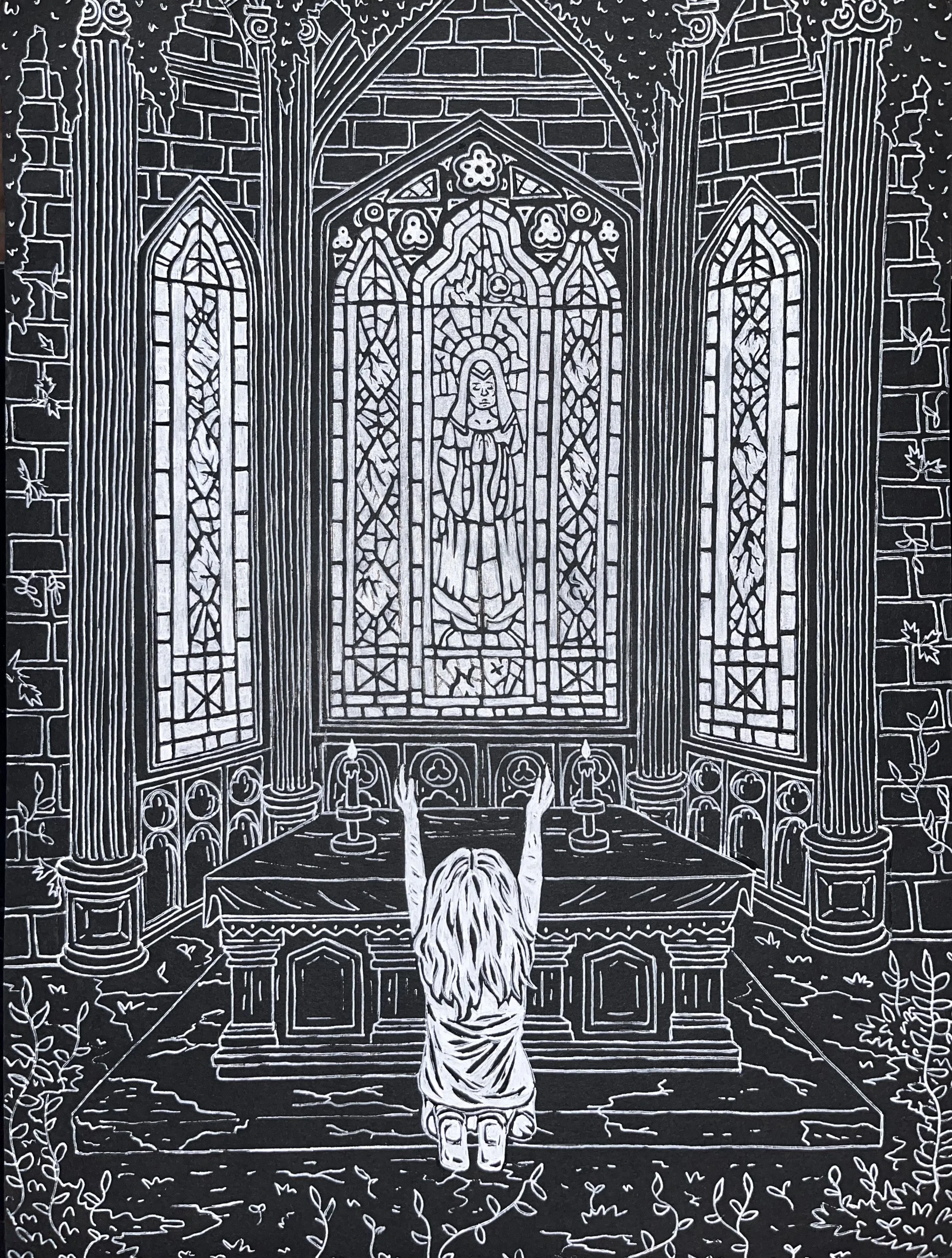
My first project for my Illustration Intensive 3 class was to make an artwork that depicted two complex themes. After having found inspiration in Gothic cathedral architecture via my reimagining of the anime Soul Eater, I chose to explore that through the theme of grandiosity, with the juxtaposition of ruination via dilapidation. I also experimented with using black paper and white ink, with the entirety of this piece being done in gel pen.
Life and Death
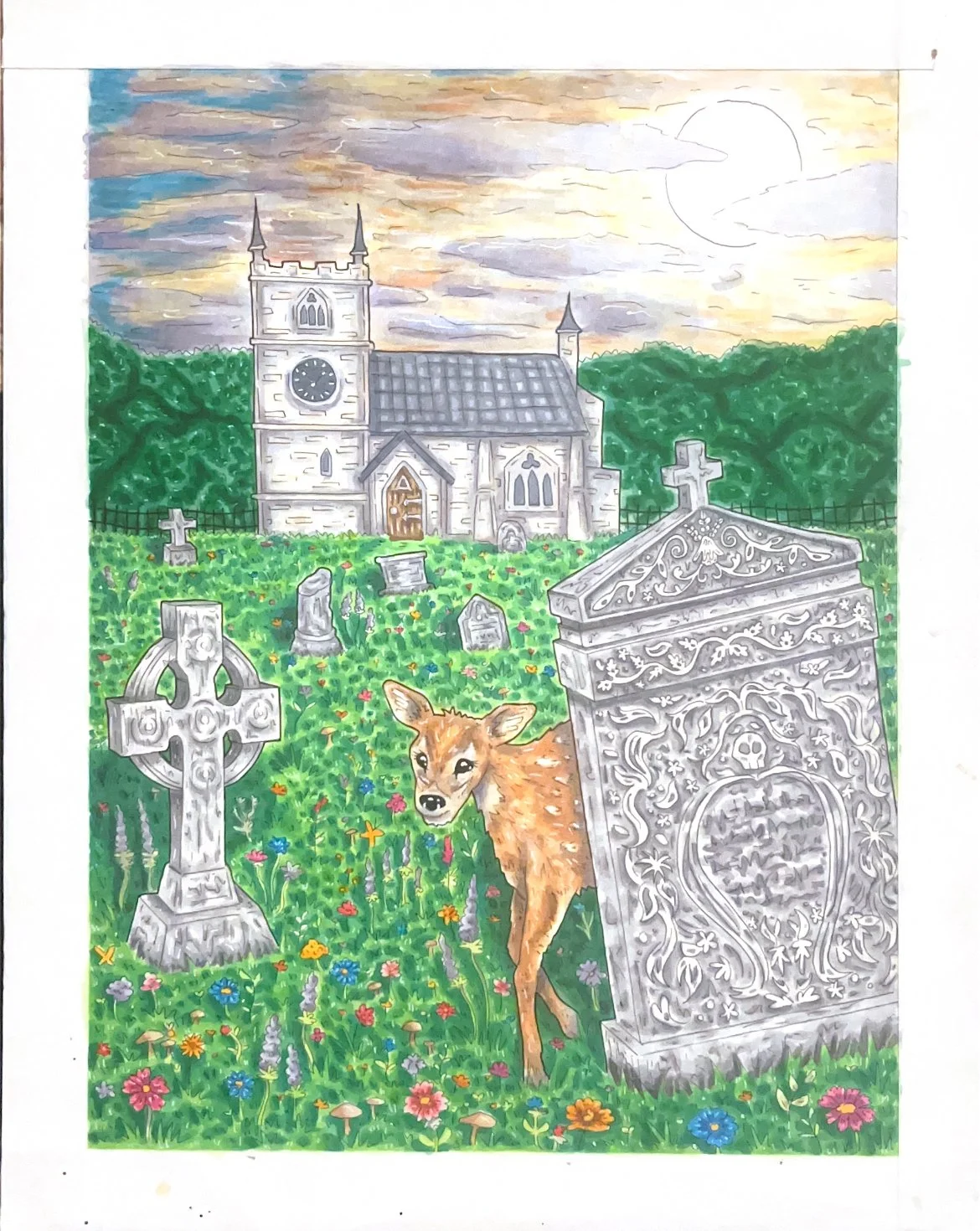
In an exercise meant to mimic that of the professional art world, our second project for Illustration Intensive 3 was to rework a classmate’s concept from a previous project. I was assigned “life and death” as my theme, which caused me to continue to experiment with gothic architecture and iconography. I took a lot of inspiration from the English countryside, which I felt perfectly embodied the prompt- a place that is full of flourishing nature juxtaposed with sporadic churches and graveyards. Something I challenged myself to do was to incorporate incredibly saturated colours, as I wanted to take that characteristic in my usual work and apply it to something new.
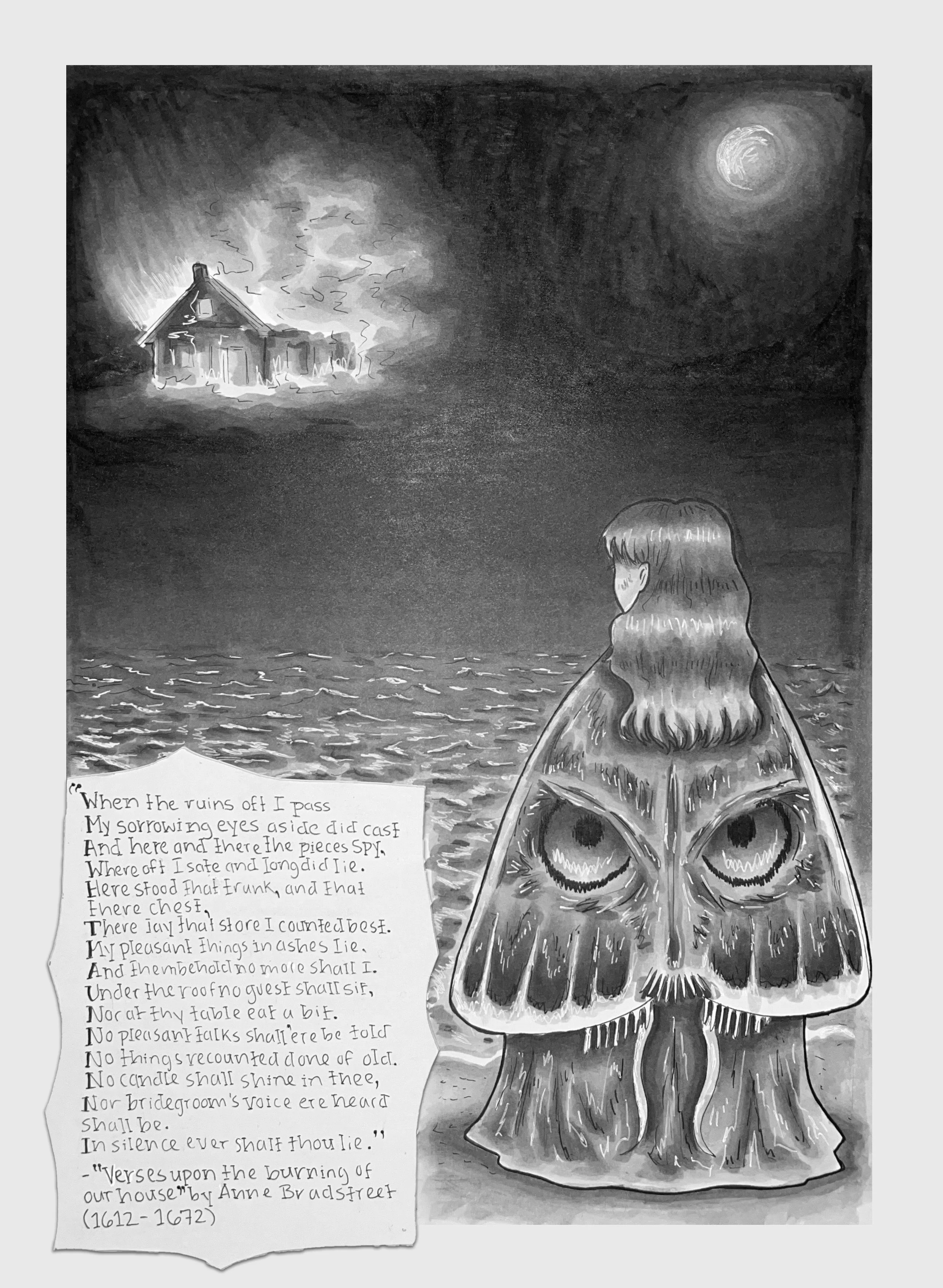
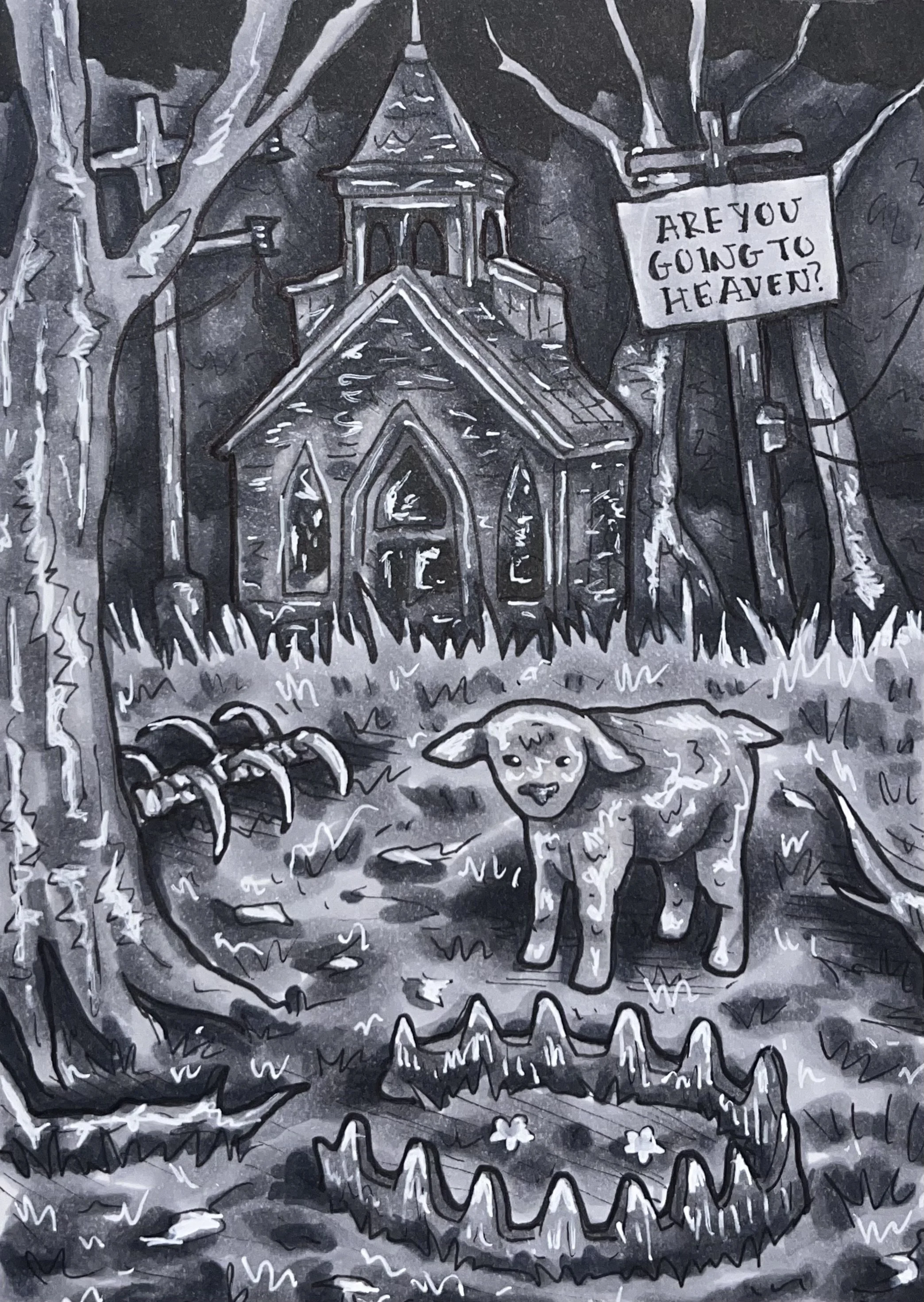
For my prethesis exploration, which was meant to be a chance to explore potential thesis topics without necessarily committing to one, I wanted to explore the synthesis of poetry as typography in my illustrative work. After curating a collection of “ominous” imagery during the summer, which I had begun to explore as a subject matter in my work, I began to take an interest in eighteenth century bookplate illustration and its ornate aesthetics. After creating an initial monochromatic illustration to get a feel for the style I wanted to work with, I created three pages for a hypothetical poetry anthology, with the poems being sourced from the Victorian era.
Prethesis Exploration
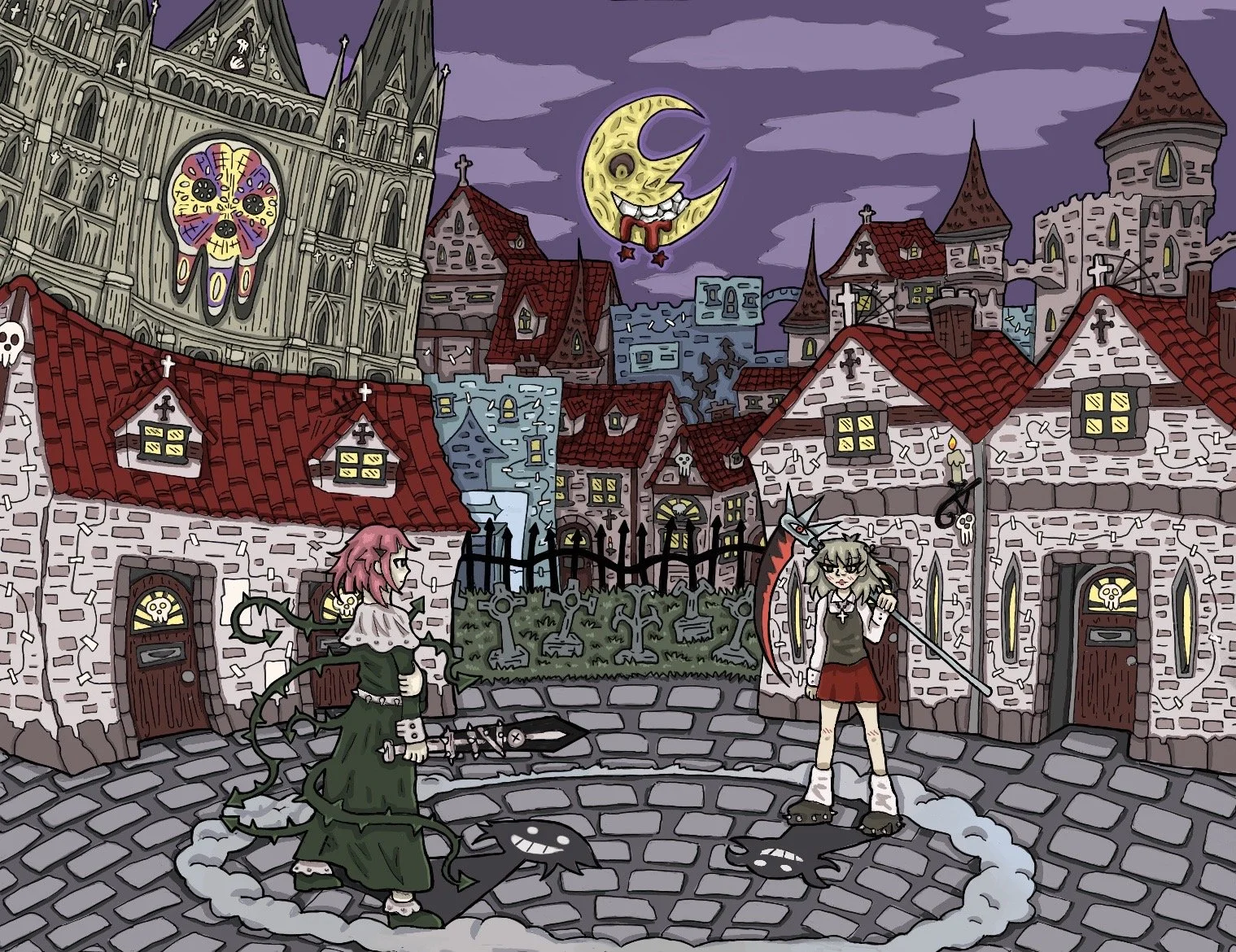
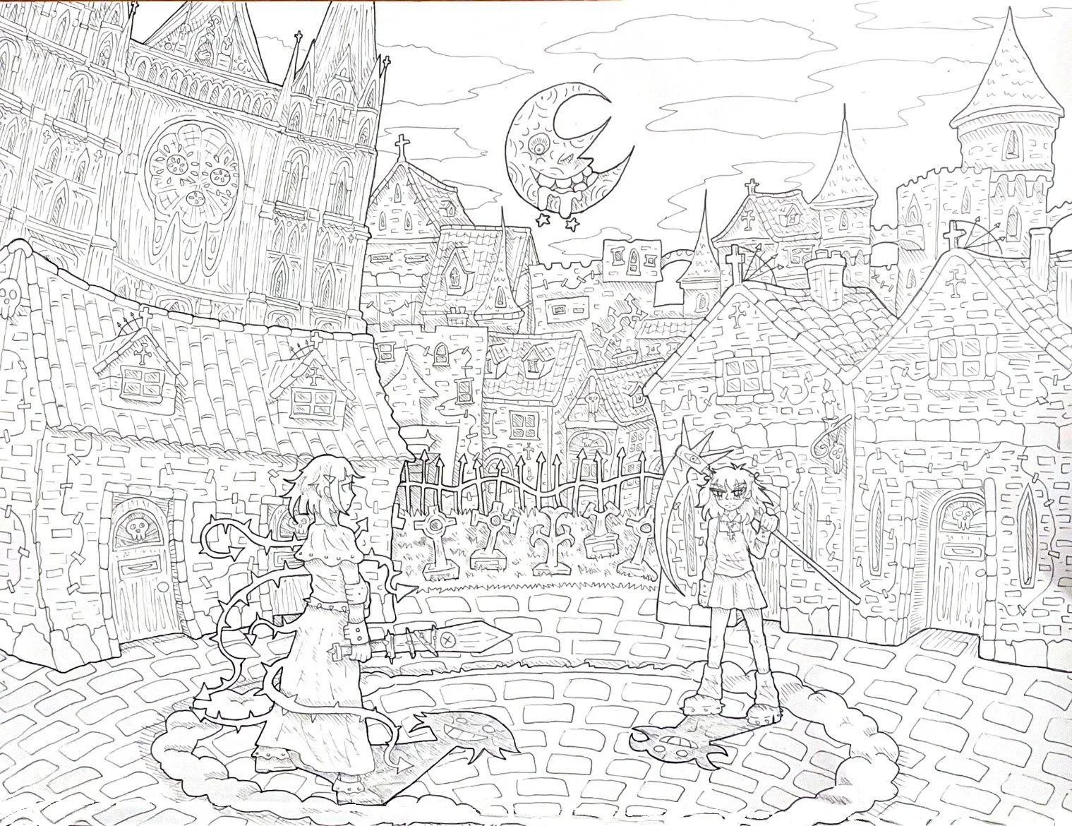
For my second project in Illustration Intensive 2, we were tasked with making a complex illustration redesigning a pre-existing world. I chose Soul Eater (an anime/manga), because I have always been inspired by the aesthetic and world/character-building within in. I made minor changes to two of the characters, Crona and Maka, and used extensive references from the manga to create buildings reminiscent of the aesthetic, yet changed somewhat. I also added a cathedral for dramatization, which has ultimately led me to recently become more inspired by classical architecture. I was also very proud of the linear, which has further sustained my interest in using ink and experimenting with line weights.
Re-designing a Pre-existing World
Personal Tomb Comic
This comic was the result of my first project for my Product Environment and Material class, which encourages experimentation and designing unconventional things. For our first prompt, we were supposed to design a tombstone/resting place for ourselves (grim, I know). In a completely ideal, limitless world, I would want my body to somehow become a tree, which would then have a treehouse mausoleum built around it, filled with a mural I (somehow) painted in a space where my loved ones could just chill out in.
“How to Make an Animation”
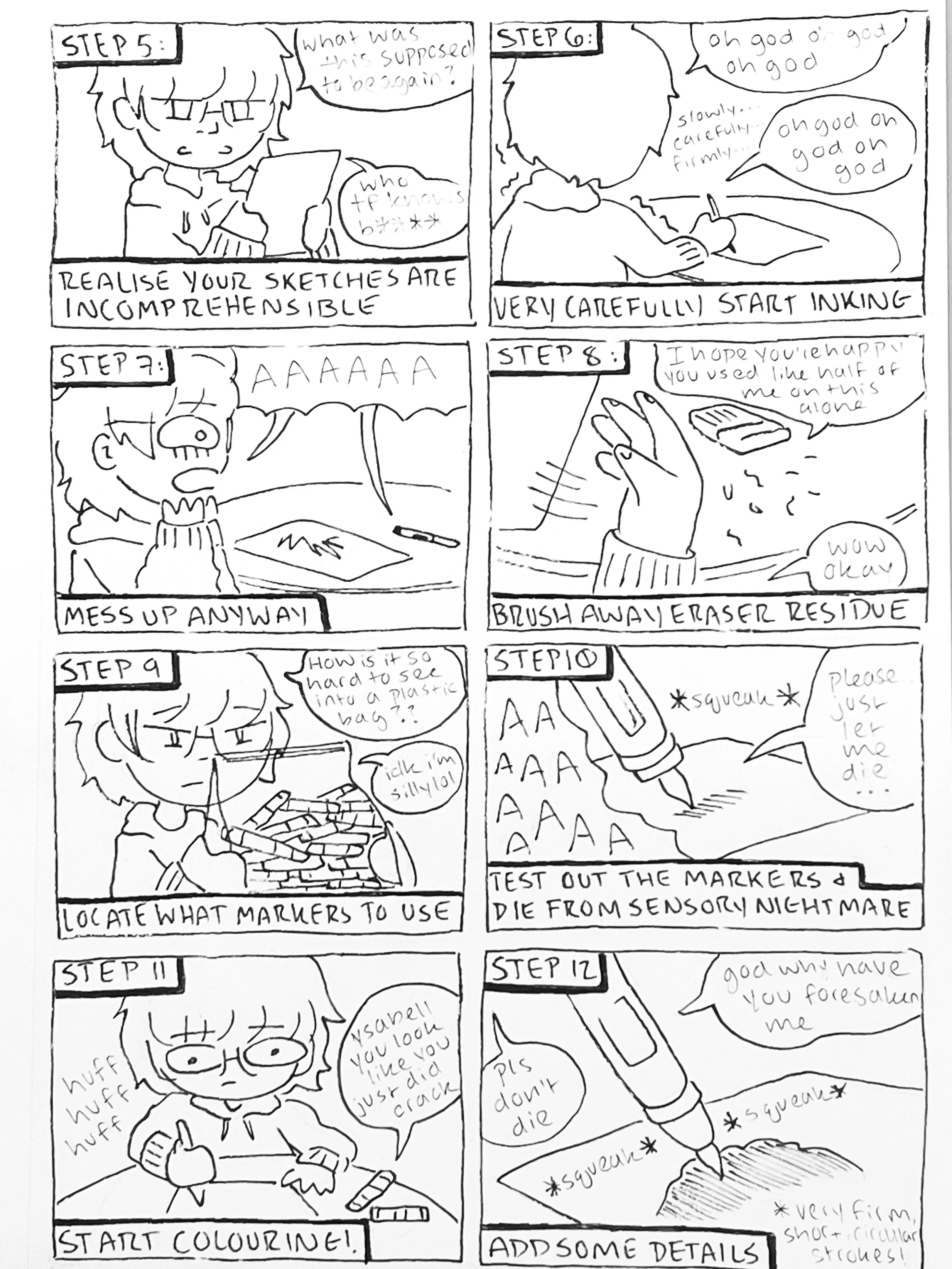
For my sophomore year English class, we were instructed to produce an artwork or comic delving into our sensory experience when art-making. As I spent much of sophomore year learning how to animate with Adobe After Effects, I chose to make my work a piece that satirically mocked the process, both personal and technical level.
Experiential Map of Pratt Playground
Pratt Playground has become a place dear to my heart during my time at Pratt, so when we were tasked with creating a map that conveys both narrative and geographical information, I was immediately inspired to recreate it topographically. While I drew an accurate representation of the park, I also took the time to list my favourite places to relax, what activities typically occur in what areas, what areas typically have the most sound, and many more details.
Pop Art Portrait
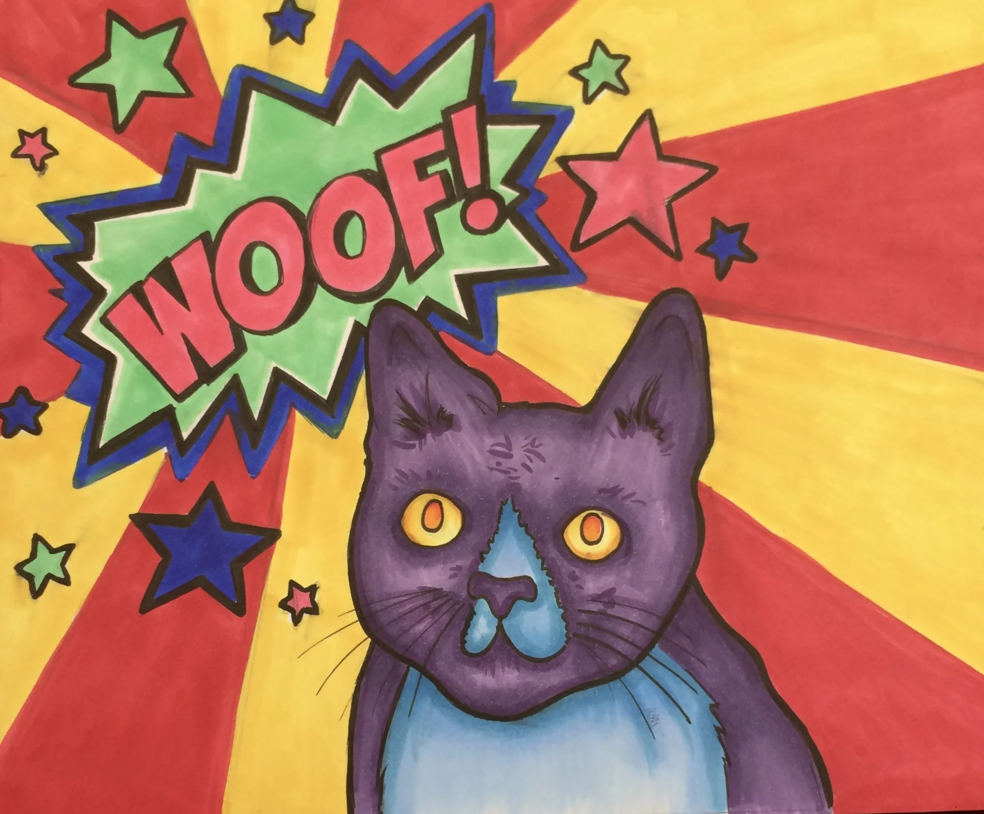
While taking AP Studio Art in high school, experimentation and versatility were highly emphasised, particularly for the “Breadth” section of the AP exam portfolio. Through this, my art teacher pushed me to explore new styles, such as pop art, to push me out of my comfort zone. Despite it being a few years old, this piece is still close to my heart, especially with its depiction of my childhood cat, Kippy.
AP 2D Design Concentration Piece
For the second half of my AP 2D Design portfolio, we were tasked with making a fifteen piece series relating to a single topic. I chose to make a series of illustrations about growing up and the loss of childhood wonder, in which this piece was the fourth sequentially. Though this is an older piece, it was specifically praised by the AP exam scorers, and also specifically caused me to be awarded a major scholarship to the Moore College of Art and Design.

